The Hidden Detail in Wendy’s Logo That Most People Miss
Let’s be honest—every now and then, indulging in fast food is one of life’s guilty pleasures, right? And when it comes to iconic chain restaurants, Wendy’s is always at the top of my list. But did you know that Wendy’s logo hides a little secret most people don’t even notice?
The Hidden Meaning Behind Popular Logos
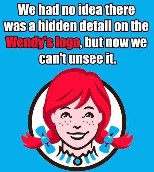
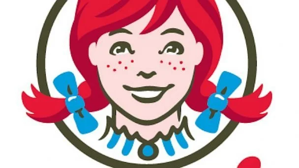
Wendy’s famous logo, featuring the cheerful red-headed girl, actually contains a hidden detail that’s easy to overlook. The girl, Wendy, was modeled after the daughter of Wendy’s founder, Dave Thomas. But here’s the kicker—her ruffled collar subtly spells out the word “MOM.” It’s a simple yet clever touch that adds a warm, family-friendly vibe to the brand. Once you see it, you can’t unsee it!
Clever Logo Design Choices
Wendy’s isn’t the only brand with hidden meaning in its logo. Take Subway, for example. Ever noticed how the two arrows in its logo point in opposite directions? That’s meant to symbolize the entrance and exit of an actual subway system. It’s a subtle design choice that adds depth to the brand’s identity without being too obvious.
Cultural Tributes in Branding
Beyond fast food, brands like Toblerone also incorporate local culture into their logos. The Swiss chocolate company’s logo features a mountain, which cleverly hides a silhouette of a bear—a nod to the city of Bern, Switzerland, which is known for its bear symbol. It’s a subtle way for the brand to pay homage to its roots, blending culture and design seamlessly.
More Than Just Logos
These hidden details in logos make you appreciate the thoughtfulness and creativity that go into branding. It’s like discovering a secret message left by the designers. And now that we’ve uncovered these hidden gems, I don’t know about you, but I’m definitely craving a Frosty from Wendy’s, a sub from Subway, and maybe even a Toblerone bar for dessert!